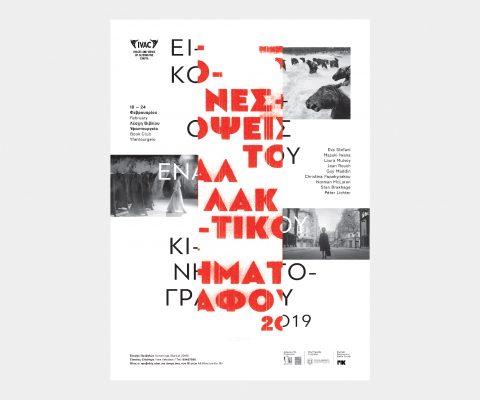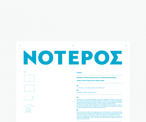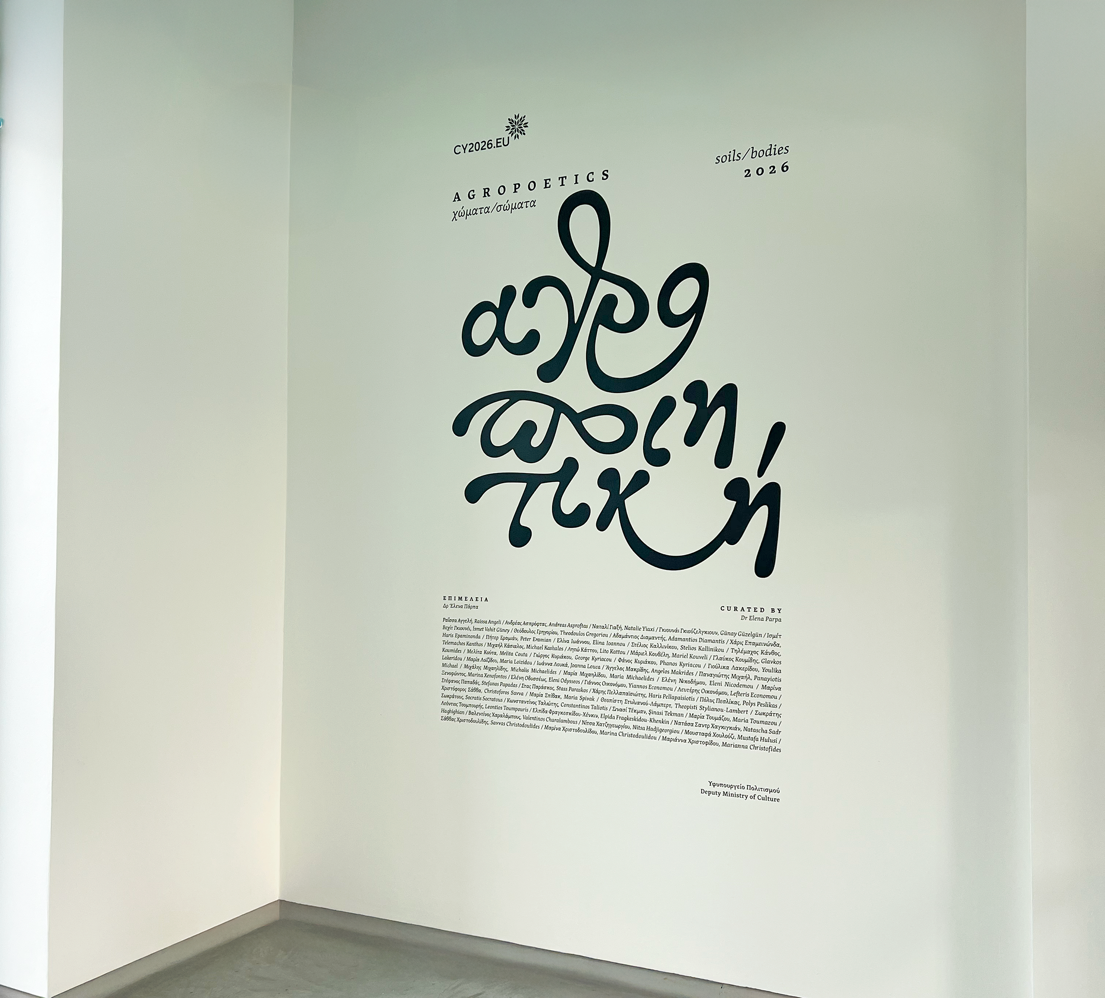
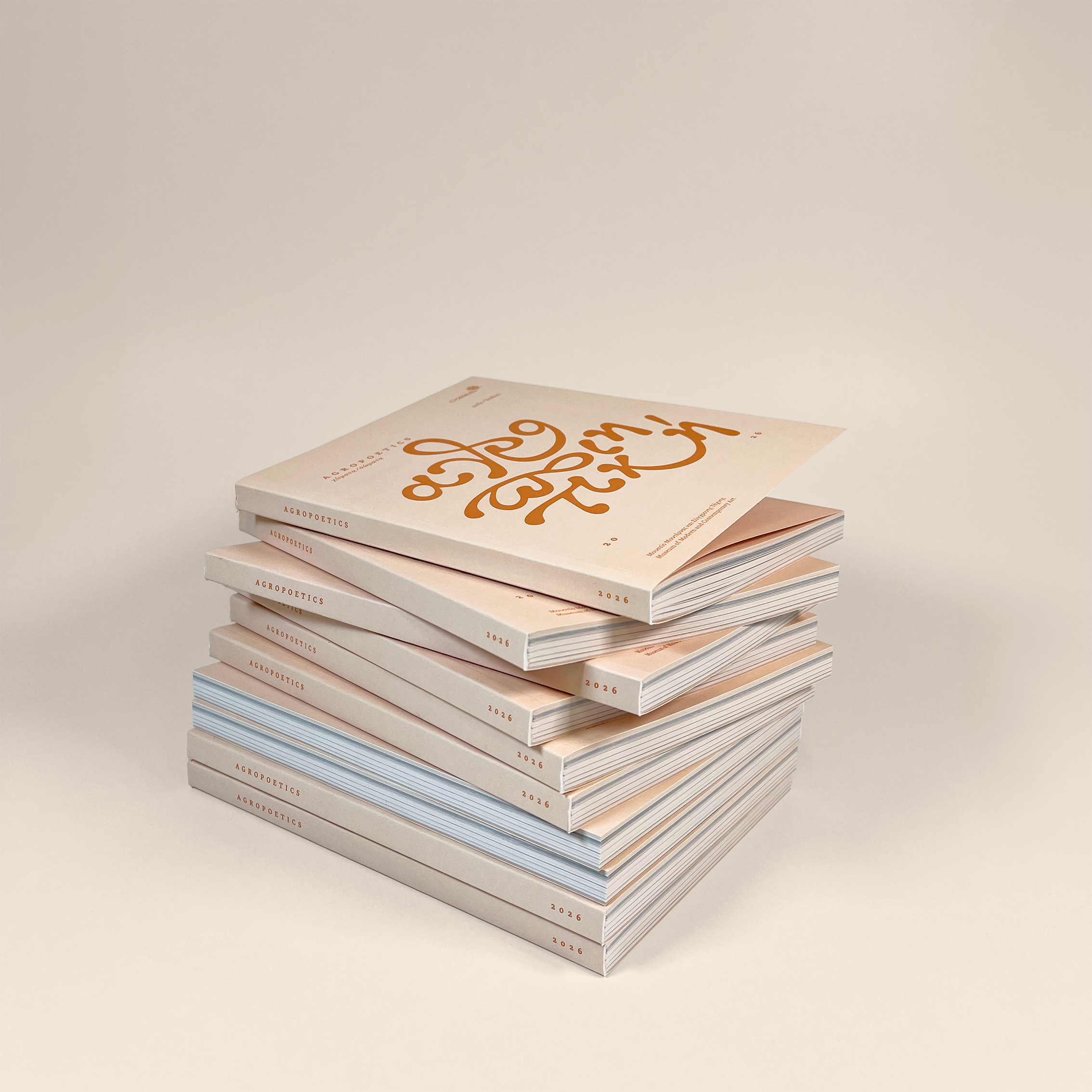
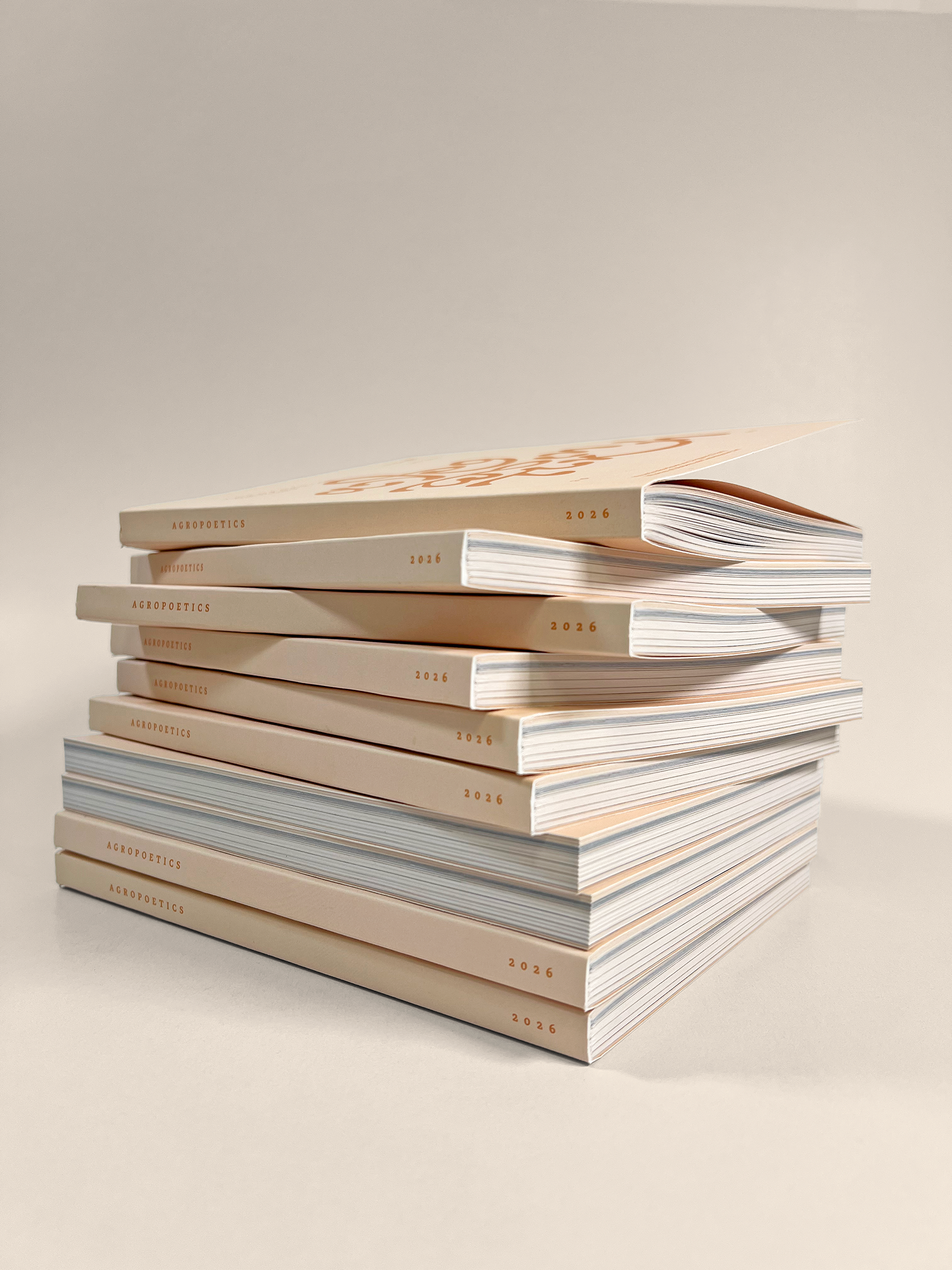
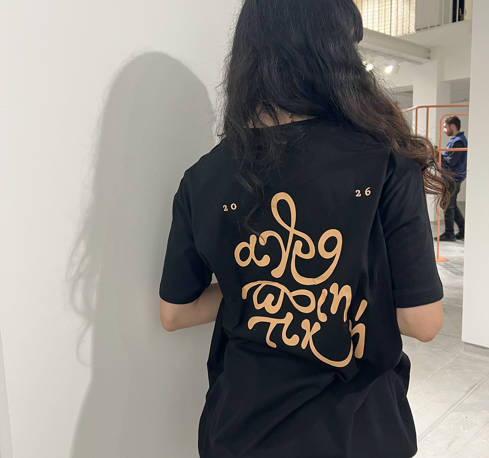
Agropoetics: soils/bodies
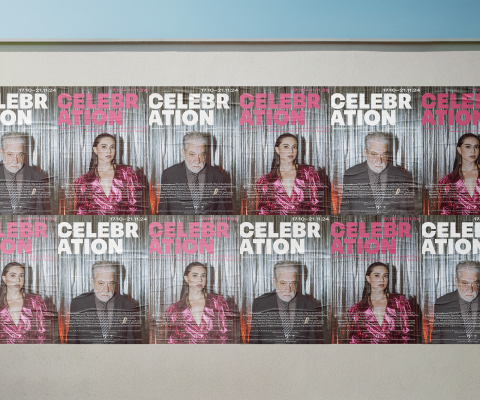
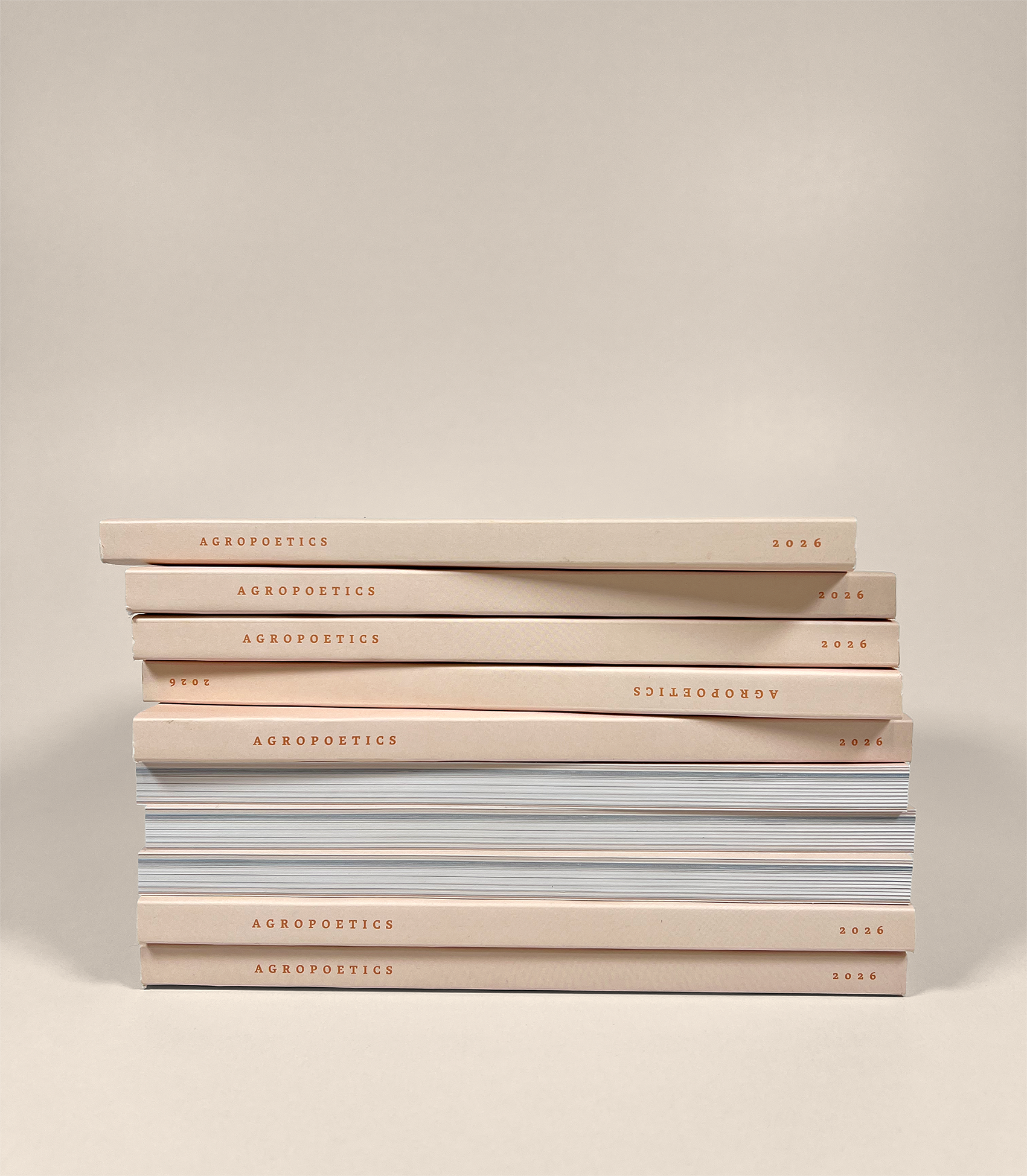
Concept and design of the visual identity, exhibition graphics and the publication of Agropoetics: soils/bodies.
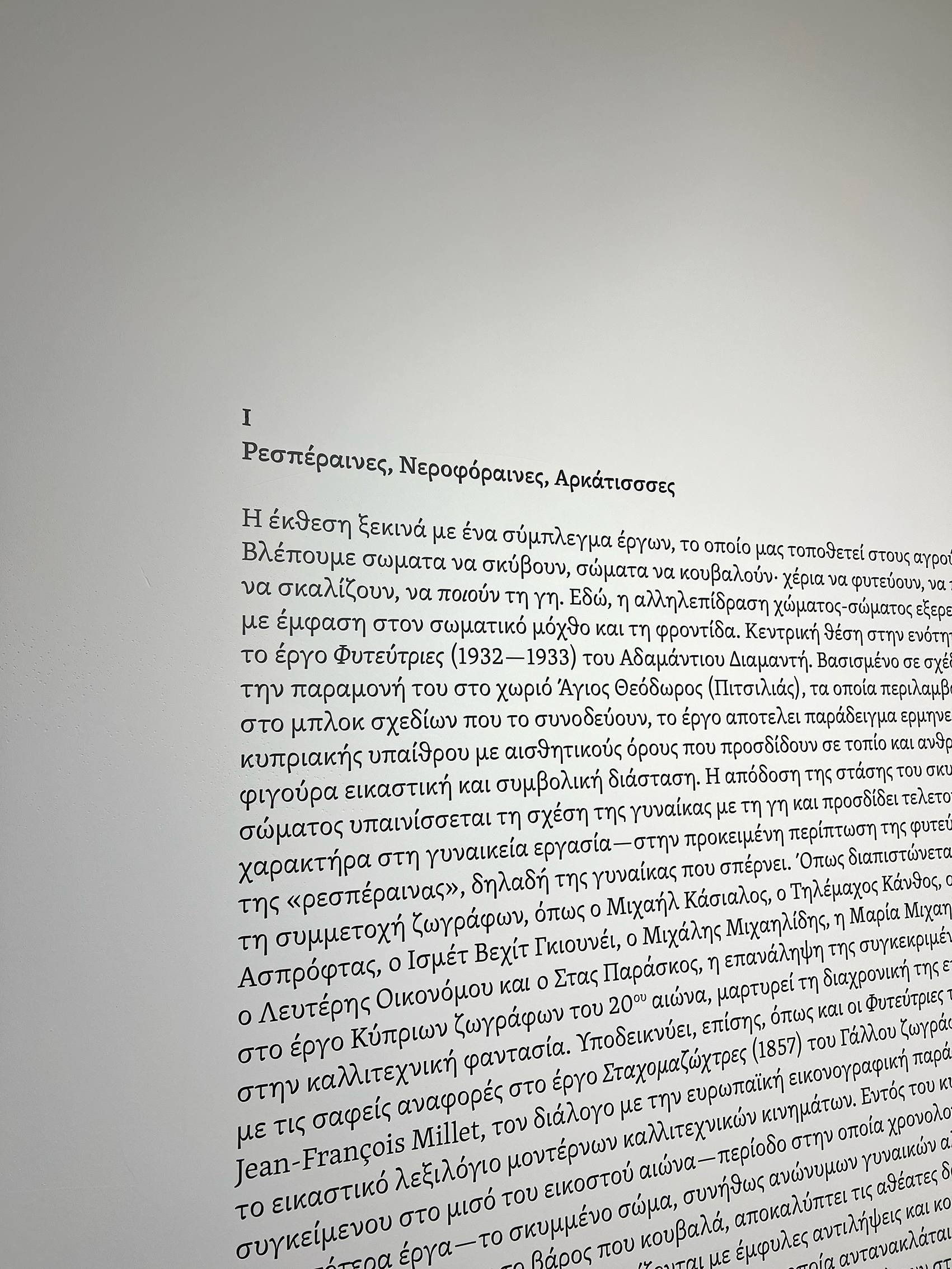
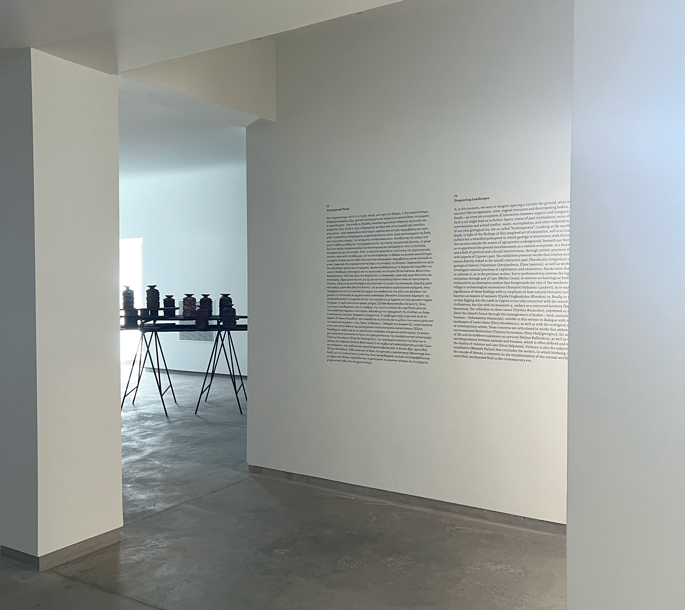
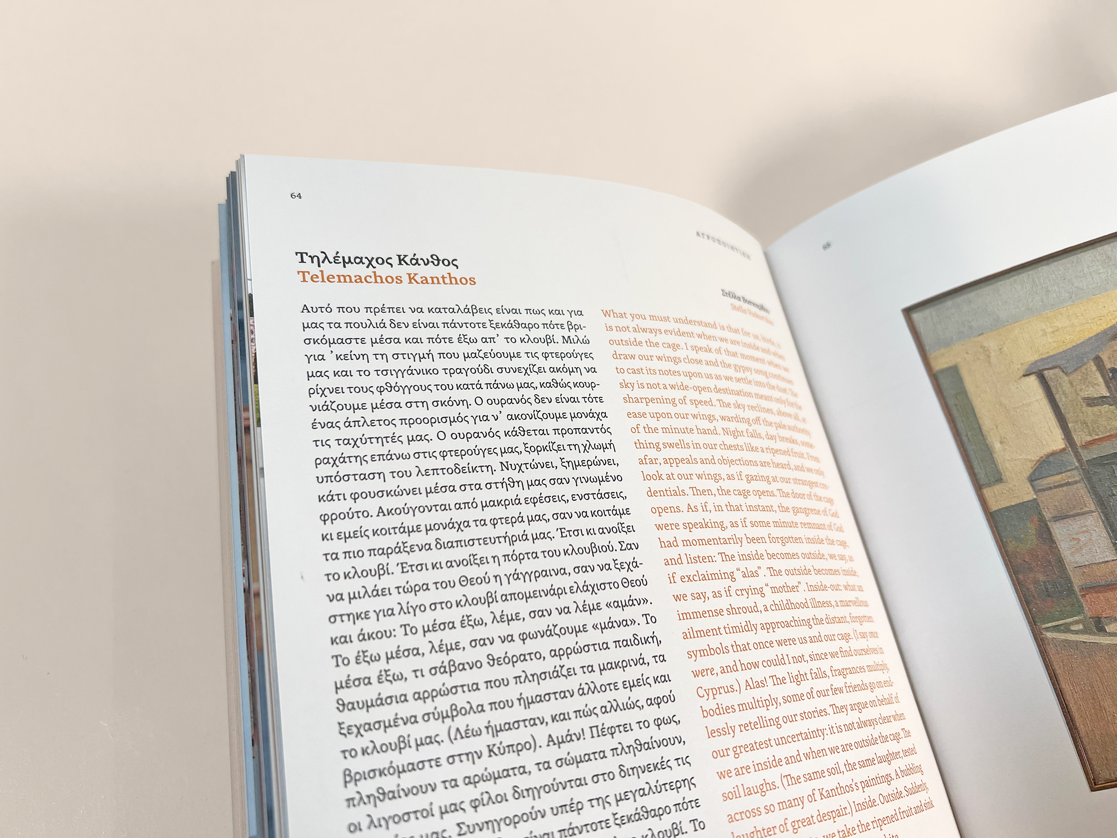
A group exhibition that brings together the work of more than fifty artists from Cyprus to suggest an open reading of the term landscape in connection with the related concepts of nature, countryside, land, place, and soil, curated by Elena Parpa.
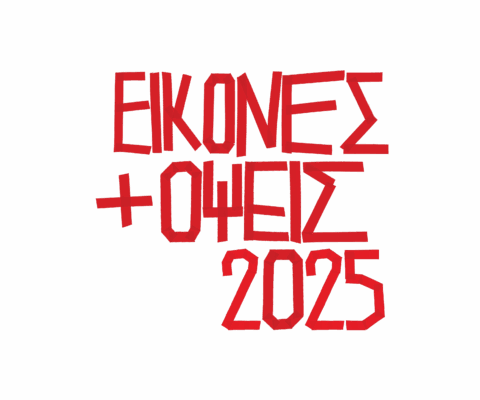
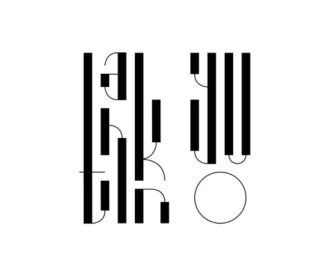
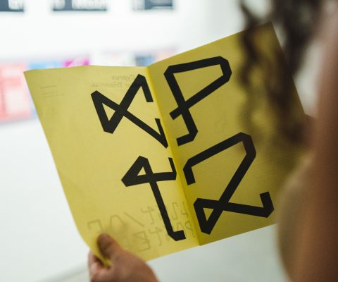
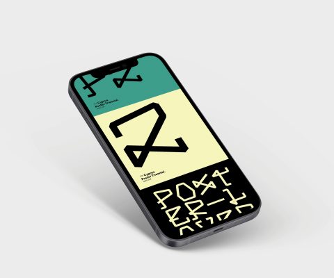
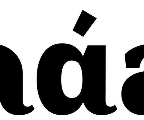
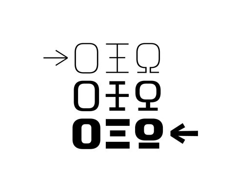
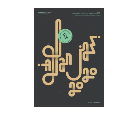
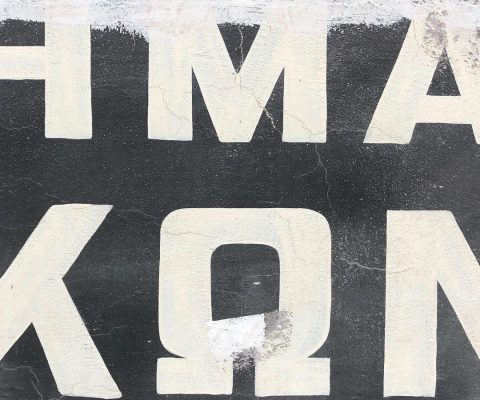
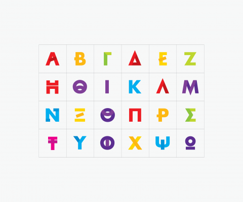
The design draws from the exhibition title “Agropoetics” and its distinctly Greek resonance. It also reflects a deliberate exploration and use of the letterforms unique to the Greek character set.
The title of the exhibition, Agropoetics, forms the central visual element of its identity and overall communication. The composition of the title (lettering) draws inspiration from the typeface Grecs du Roi (“The King’s Greek”, 1544–1550), one of the earliest Greek typefaces created following a commission by King Francis I of France to Claude Garamond. Garamond based his designs on manuscripts by the Greek scholar Angelos Vergikios, which were characterized by an extensive use of abbreviations and ligatures. Referencing these manuscripts, Garamond designed the first metal types for printing Greek books, providing the printers of the time with a rich range of possibilities for composition and textual form. Each word, therefore, became a small, autonomous creation. That is the feeling I wanted to give to “Agropoetics”.
Today, George Matthiopoulos, Greek Professor of Type and Typography and researcher on Greek typeface design, is working on a contemporary revival of Grecs du Roi, which is still under development. The Agropoetics title was created using the work-in-progress files of this revival, attempting to connect historical typographic tradition with a contemporary visual and conceptual approach.